During our trip to Cuba, my daughter pointed out that I’ve never talked about advertising in my blog. She asked me if I’d seen differences in the way American companies advertise in comparison to Europe. I probably bored her with some technical details but, yes, there are differences.
Searching in my collection of ads that could make their way to the Cross Border Blog, I found an excellent example for this topic in airline advertising. Although the ads featured here were all placed in English-speaking magazines, they express the ways that French and German companies advertise.
Comparing Airlines Advertisements
 Air France Ad
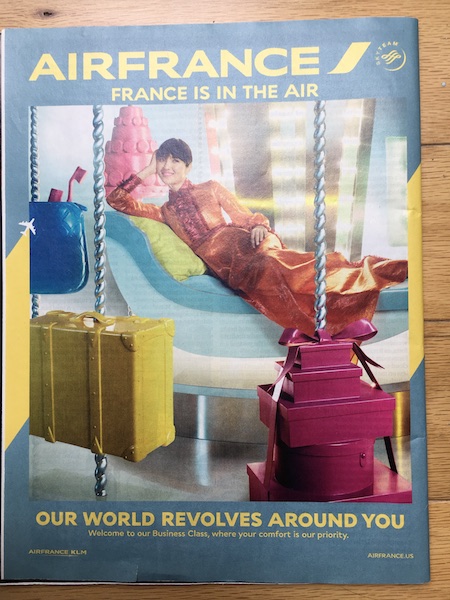
This Air France ad was featured in The Economist on April 23, 2016. It shows a woman with a long dress, probably made of silk. She poses in a relaxed position on a chaise longue, surrounded by vibrant boxes and suitcases. Colors, objects, pose—every element conveys the message, “I’m sophisticated, I’m classy, I’m elegant, and I’m French.” The branding for Air France is strong, placed in full width at the top of the ad. I had to look carefully to find out the sales proposition, written in the smallest font at the bottom: “Welcome to our Business Class, where comfort is our priority.”
 Lufthansa Ad
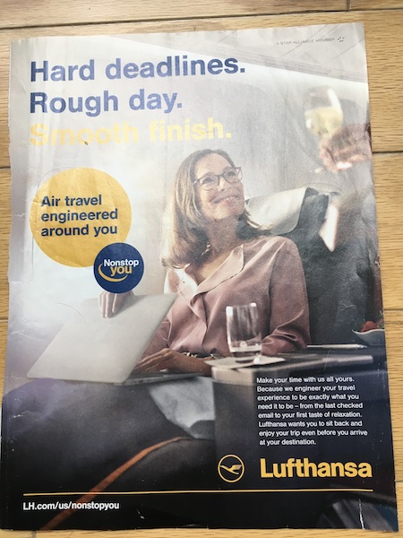
In contrast, the Lufthansa ad has more text and incorporates mostly grayish colors. A business woman wears glasses and sits in front of a laptop. She is closing her computer and smiles at a steward offering a glass of wine, maybe sparkling, The headline is all German, reminding us of a demanding work schedule: “Hard deadlines. Rough day.” The promise of a “Smooth finish” is barely readable. Then, we have the German engineering touch at two different places (for those courageous enough to read all the text!). In the Lufthansa orange bubble, we read “Air Travel engineered around you,” and in the copy at the bottom right, “Because we engineer your travel experience to be exactly what you need.”
These two ads are a perfect summary of their opposite advertising worlds. Rationality against emotion. Facts vs. feelings. German information vs. French seduction. The German ad wants to inform the reader, while the French ad wants to seduce the observer.
Comparing an American ad with a German (or French) ad
Let’s finish with an American airline. United Airlines has attracted horrible PR lately with its forceful removal of a passenger in April 2017. Among the many reasons why this situation was a terrible mistake, have you ever considered this one? United has a longstanding marketing campaign titled “Fly the friendly skies.” Well, it will take them a lot of money and effort to restore public trust!
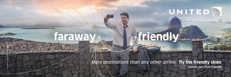
But, back to the advertisement. United’s ad shows a large picture with a friendly man. It features an abstract route map, one of which could be interpreted as a smiley face. There is minimal text, but the branding and selling proposition—”More destinations than any other airline”—are a decent size.
The United ad is sympathetic and supports a clear message. For the sake of comparing this specific American ad with German or French ones, I’d say that United made a kind of German ad, just more engaging. This doesn’t really seem surprising once you consider that almost 50 million Americans claim to have German origins.
What do you think of these airline advertisements? Do they match your brand’s travelling experience?
Photo credit:
Ads by Lufthansa, Air France, or United Airlines
Featured Image by Olly
